

Foto: Shropshire Museums · Public domain · Wikimedia Commons
Show answer
Roman square capitals
The script of Roman inscriptions: chiselled, strict, with no lower case. Our capitals descend from it unchanged. (1st c. BC: 5th c.)
14 questions · Language
Script can be seen before it is read. With a few shapes in mind you can tell which century a manuscript page comes from without deciphering a single word; that is what palaeography does. The differences are greater than you would think. Roman capitals know no lower case: chiselled, strict, monumental. Uncial rounds everything off and keeps the letters between two lines. The insular hand of the Irish monasteries sets heavy wedges on the ascenders. Charlemagne's Carolingian minuscule is so clear that it still looks almost like our lower case: no coincidence, because that is exactly what it became. Then the high Middle Ages break the curves: textura stands so close that the page looks woven, while the south stays round and broad with rotunda. The humanists reach back and thereby create roman type; alongside it the broken line continues in the German-speaking world, as Fraktur in print and secretary hand or cursive in writing. This pack shows specimens and asks one thing only: which script is this? The period appears with the answer: after a few rounds you will place an unfamiliar page roughly by yourself.
Practise for freePurFact brings every card back right before you would forget it. That's how knowledge sticks.
Which script is this?
Foto: Shropshire Museums · Public domain · Wikimedia Commons
Roman square capitals
The script of Roman inscriptions: chiselled, strict, with no lower case. Our capitals descend from it unchanged. (1st c. BC: 5th c.)

Foto: Unknown author · Public domain · Wikimedia Commons
Uncial
Round and broad, every letter equally tall between two lines: a majuscule script without ascenders or descenders. (4th: 8th century)

Foto: medieval author · Public domain · Wikimedia Commons
Insular script
The hand of Irish and Anglo-Saxon monasteries, with heavy wedges on the ascenders; the Book of Kells is its most famous example. (6th: 9th century)
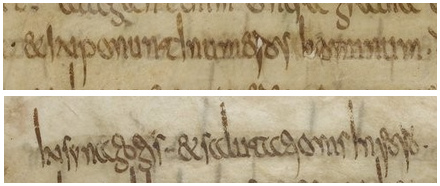
Foto: Ser be etre shi · CC0 · Wikimedia Commons
Merovingian script
Narrow, spiky and heavily cursive: the Frankish chancery hand before Charlemagne's reform, barely legible to modern eyes. (7th: 8th century)

Foto: Lowe, E. A. (Elias Avery), 1879-1969 · No restrictions · Wikimedia Commons
Visigothic script
The script of the Spanish kingdoms, until the Council of León imposed Carolingian minuscule in 1090. (8th: 12th century)

Public domain · Wikimedia Commons
Carolingian minuscule
Clear, round and the same everywhere: Charlemagne's reform. Today's lower-case letters descend from it directly. (9th: 12th century)

Foto: Original by Johannes Gutenberg (printer), Scan by Jossi · Public domain · Wikimedia Commons
Textura
Narrow, angular, broken: the letters stand so close the page looks woven. Gutenberg cut his type after it. (13th: 15th century)
🔒 The other 7 questions are part of PurFact Pro.
Open in PurFactHome · All topics · Legal notice · Privacy · Terms · Contact